


A Journey into Mobile-First Survey Design
In the fast-paced digital landscape of the 21st century, where the majority of internet users access information through their smartphones, the importance of mobile-first approaches cannot be overstated. As businesses and researchers strive to connect with their audience, it has become imperative to adapt survey designs to cater to the mobile user experience. The evolution of technology has reshaped how we collect and analyze data, emphasizing the need to master mobile-first survey design.
Imagine Sarah, a marketing strategist eager to understand her target audience’s preferences and behaviors. Armed with a vision and a stack of surveys, she embarks on a journey to gather insights that will shape her next campaign. Little does she know that the success of her endeavor lies not just in the questions she asks but in how seamlessly her surveys adapt to the mobile landscape.
As we accompany Sarah on her quest, let’s delve into the realm of mastering mobile-first survey design, exploring ten proven practices that can transform the way businesses and researchers collect invaluable data.
Understanding the Mobile Landscape
Before delving into the intricacies of survey design, it’s crucial to comprehend the mobile landscape. According to Statista, as of 2022, there were over 3.8 billion smartphone users worldwide, and this number continues to rise. Mobile devices have become an integral part of our daily lives, influencing how we shop, communicate, and even participate in surveys.
Embracing a mobile-first mindset means acknowledging the limitations and capabilities of smartphones. Consider the smaller screen sizes, touch-based navigation, and the potential distractions users face while taking surveys on their mobile devices. By understanding these factors, survey designers can tailor their approaches to enhance the respondent experience.
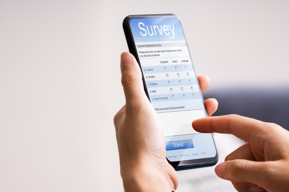
Responsive Design for Seamless Experience
One of the fundamental practices in mobile-first survey design is adopting a responsive design approach. Just as websites need to be optimized for various devices, surveys should adapt to the screen size and resolution of smartphones. Responsive design ensures that survey questions are displayed in a user-friendly manner, eliminating the need for excessive scrolling or zooming.
Studies have shown that users are more likely to abandon surveys that are not optimized for mobile devices. A responsive design not only enhances user experience but also contributes to higher completion rates, providing more accurate and comprehensive data.
Prioritize Mobile-Friendly Question Formats
Not all question formats are created equal when it comes to mobile-first survey design. While open-ended questions and extensive matrices might work well on desktops, they can be cumbersome and time-consuming on mobile devices. Opt for mobile-friendly question formats, such as multiple-choice, single-choice, and slider scales, which are not only easier to navigate but also quicker to respond to.
Research by the Pew Research Center indicates that surveys with shorter, mobile-friendly formats tend to yield more accurate and timely responses. By prioritizing these question formats, survey designers can ensure a smoother respondent experience, leading to higher engagement and participation.
Streamlining Survey Length
In the era of short attention spans, lengthy surveys can be a deterrent for mobile users. According to a survey by SurveyMonkey, 20% of respondents are likely to abandon a survey if it takes longer than 10 minutes to complete. Mobile users, in particular, prefer concise and focused surveys that respect their time constraints.
To master mobile-first survey design, aim for brevity without sacrificing depth. Focus on the essential questions that align with the survey’s objectives, eliminating unnecessary elements. This not only reduces respondent fatigue but also encourages a higher completion rate, resulting in more reliable data.
Clear and Concise Language Matters
The language used in survey questions plays a pivotal role in ensuring accurate and meaningful responses. On mobile devices, users may skim through questions quickly, making it imperative to communicate clearly and concisely. Ambiguous or complex language can lead to misunderstandings, potentially skewing the data collected.
Studies have shown that surveys with straightforward and concise language generate more accurate responses. By adopting a mobile-first mindset in language choice, survey designers can enhance the clarity of their questions, minimizing the risk of misinterpretation and maximizing the reliability of the collected data.
Optimizing for Touchscreen Interaction

Mobile devices rely on touchscreen interaction, a factor that survey designers must consider to ensure a seamless user experience. Incorporating touch-friendly elements, such as large buttons and easily tappable areas, can significantly enhance respondent engagement. Users should be able to navigate through the survey effortlessly, minimizing the risk of errors or frustration.
According to a study published in the International Journal of Human-Computer Interaction, surveys designed with touchscreen optimization in mind result in higher respondent satisfaction and increased data accuracy. By prioritizing this aspect of mobile-first survey design, researchers can tap into the full potential of mobile data collection.
Utilizing Progressive Profiling
Progressive profiling is a dynamic approach to survey design that tailors subsequent questions based on respondents’ previous answers. This technique not only streamlines the survey-taking process but also ensures that users are not bombarded with irrelevant questions. For mobile users, progressive profiling is particularly effective in maintaining engagement and preventing survey fatigue.
Research by Qualtrics indicates that personalized and adaptive surveys lead to higher completion rates. By implementing progressive profiling in mobile-first survey design, businesses and researchers can gather more detailed insights without overwhelming respondents, ultimately improving the quality of the data collected.
Offline Accessibility for Uninterrupted Data Collection
In the mobile-first era, connectivity issues can pose a significant challenge for survey designers. To mitigate the impact of sporadic internet access, incorporating offline accessibility features is crucial. Respondents should be able to start, pause, and complete surveys even when offline, with the data automatically syncing once a stable internet connection is restored.
According to a report by GSMA, approximately 45% of the global population still lacks internet access. Designing surveys that accommodate offline usage ensures inclusivity and a broader reach, especially in regions with limited connectivity. This approach not only improves the reliability of data collection but also expands the demographic representation of survey respondents.
Real-Time Feedback and Validation
Mobile-first survey design goes beyond merely adapting to device specifications; it involves creating an interactive and engaging experience for respondents. Incorporating real-time feedback and validation mechanisms during the survey-taking process can enhance user confidence and accuracy in responses.
Research conducted by the American Association for Public Opinion Research suggests that real-time feedback, such as acknowledgment of completed sections or validation of entered information, leads to a more positive respondent experience. By leveraging these mechanisms, survey designers can foster a sense of collaboration with respondents, resulting in more accurate and valuable data.
Robust Testing and Iteration
No mobile-first survey design is complete without thorough testing and iteration. Before deploying a survey to a wider audience, conduct extensive testing on various mobile devices and platforms. Identify and address any potential usability issues, ensuring a seamless experience for respondents across the board.
Iterative testing is an ongoing process that allows survey designers to adapt to evolving user behaviors and technological advancements. Regularly update and optimize surveys based on feedback and performance metrics, keeping abreast of industry trends and user preferences. This commitment to continuous improvement ensures that mobile-first survey designs remain effective and relevant over time.
Conclusion: Navigating the Mobile Frontier
As we conclude our journey alongside Sarah, the marketing strategist, through the landscape of mobile-first survey design, it becomes evident that mastering this approach is essential for unlocking the full potential of data collection in the digital age. The practices outlined – from understanding the mobile landscape to robust testing and iteration – provide a roadmap for businesses and researchers seeking to connect with their audience in a mobile-centric world.
By prioritizing a mobile-first mindset, survey designers can create experiences that resonate with the habits and preferences of today’s smartphone users. The statistics and data presented throughout this article underscore the importance of adapting survey designs to the realities of the mobile landscape, where billions of users hold the key to valuable insights.
In the ever-evolving digital ecosystem, where technological advancements shape how we interact with information, mastering mobile-first survey design is not just a strategy; it’s a necessity. As businesses and researchers continue to navigate the mobile frontier, the proven practices outlined in this article serve as beacons, guiding them toward a future where data collection seamlessly aligns with the mobile experiences of the global audience.
Have a project that you’re looking to field?
Logit can help. Just fill out the form below and a Logit Group team member will be in contact with you shortly. Get a quote today.